



If your company exhibits regularly, you know how much discussion a graphic can generate. The logo should move left. The blue looks different on a colleague’s screen. Someone wants a larger product image; someone else prefers yesterday’s version. None of these requests is unreasonable. You want your stand to look right, and so do we. But eventually another revision can create more risk for the project than value for its visitors.
Exhibition results depend on your products, team, audience and meetings. Trade show booth graphics are important, but they cannot carry the entire result. Our job as a stand builder is to help make them clear, practical and ready before printing becomes a race against the installation schedule.
Why Trade Show Booth Graphics Matter More Than You Think
Good booth visuals help people recognize your company and understand its offer. They support marketing, but they cannot compensate for a poor location, weak visitor engagement or an unprepared sales team.
The 3-second test: what visitors register before reading a word
Think about walking through a busy exhibition hall. You notice familiar brands and interesting products without examining every wall. Try looking at your stand in the same way: can someone approaching from the aisle identify the brand or its main offer quickly? The “three-second test” is a design exercise, not a promise that a visitor will stop.
Graphics as a brand system, not decoration
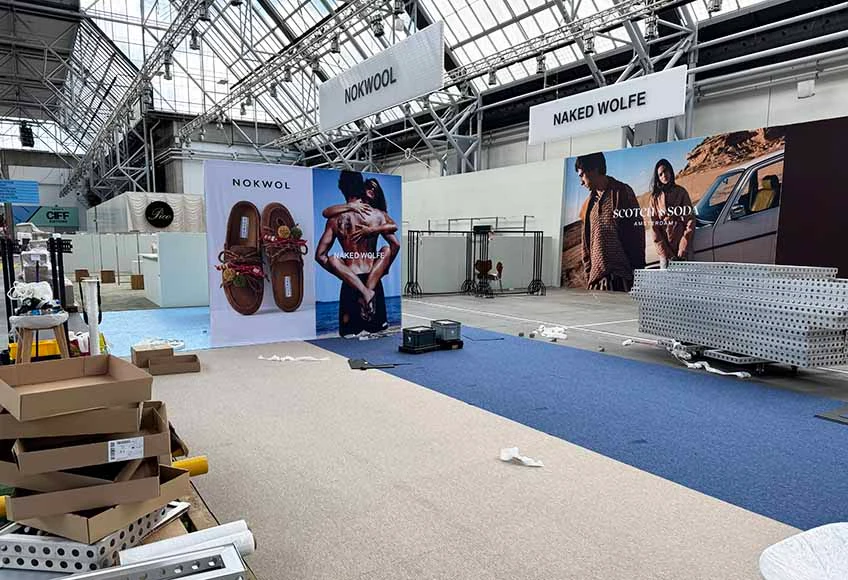
Your signs, walls and product displays have different jobs. One attracts attention; another supports a closer conversation. Effective trade show exhibit graphics form a coherent system rather than a collection of images chosen because individual colleagues liked them.
How to Design Trade Show Graphics That Actually Get Read
If you are asking how to design trade show graphics that people can use, begin with what visitors need to understand, not with how much wall space is available. A large printed surface is not a substitute for a brochure.
Visual hierarchy: what should stand out first, second, third
Decide what should be recognized first: the brand or product category. Next comes the relevant benefit; details follow for people who approach. A familiar brand may lead with its logo; a lesser-known manufacturer may show its product first.
Message clarity: how much text your graphics can actually hold
Visitors rarely read paragraphs in an aisle. Keep the main message concise, and leave specifications to product stations, screens and discussions with your team. Start a conversation rather than reproduce your website.
Color, contrast and typography that read from a distance
Fine lettering on a designer’s monitor may disappear under hall lighting. Contrast, font weight, reflective finishes and viewing distance matter more than a barely perceptible color adjustment. In trade show graphics design, a headline that cannot be read is a problem worth fixing; a blue that one colleague would prefer slightly warmer may not be.
Image resolution and quality for large-format printing
“We found this image online. Can you make it four metres wide?” Sometimes yes, sometimes no. A small file does not acquire real detail when enlarged. Cropping a horizontal photograph for a narrow vertical panel may cut out the product itself. AI enlargement can introduce invented details or distort logos, while an image found online may not be licensed for commercial use. Check resolution at print size, proportions, composition and rights before promising that any picture will fit.
Trade Show Banner Design: Formats and Where Each One Works
Useful banner planning starts with location and purpose, not a template. Different formats solve different problems, and even a beautiful banner can feel out of place on a carefully designed custom stand.
Roll-up and pull-up banners: where they work best
Roll-ups are practical for presentations, temporary information points and smaller exhibition spaces. Several of them scattered around a custom stand, however, can make a coordinated environment look improvised.
Step-and-repeat and photo-moment banners
Design photo backdrops for people standing in front of them. If the central logo disappears behind the first group photograph, the layout has missed its purpose.
Hanging and overhead banners for hall-wide visibility
Overhead signs can help visitors find a stand from another aisle. Check permitted heights, suspension points, loads and venue rules before approving the design.
Banner design tips: layout, sizing and proportions
Practical trade show banner design tips concern the actual finished format. A wide-wall composition may fail on a narrow banner; hardware can conceal text; a crop can remove the focal point. Evaluate trade show banner design ideas at real proportions and viewing distances. These trade show banner design tips also apply to trade show booth banner design: a convincing rendering is not yet a print-ready solution.
Beyond Banners: Floor, Counter and Wayfinding Graphics
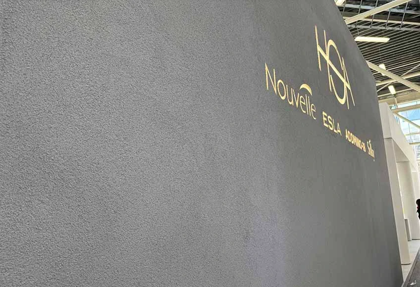
Not every surface needs another logo. Consistent trade show exhibit graphics can guide visitors without repeating the same message. Good visual planning uses different parts of the stand for different visitor needs.
Floor graphics for wayfinding and branding underfoot
Floor graphics can direct visitors toward a demonstration. Materials must meet flooring and safety requirements.
Counter, podium and product graphics for close-up engagement
Counters and product displays can carry more detailed information because people view them closely. Remember that equipment, brochures and staff may cover the very message you intended to show.
Directional and wayfinding signage across the booth
Larger stands may need signs for meeting rooms or demonstrations. Wayfinding should reduce confusion.
Why Late Graphic Approval Can Put Your Exhibition Stand at Risk
Here we would like to ask our clients for a little understanding. When we remind you about artwork deadlines, we are not trying to hurry your marketing team for our convenience. We are protecting the production and installation schedule you are counting on.
Graphic design should begin with stand design
Graphics cannot be treated as stickers added after construction. Panel joints, doors, screens, lighting and furniture determine what fits and what remains visible. The graphic concept should develop alongside the stand, even if final copy and artwork are approved later. Otherwise a logo may cross a joint or an important message may end up behind a display.
When another revision stops improving the result
Marketing approves a wall graphic. Management asks to enlarge the logo. Someone prefers a different shade; another person wants the previous photograph back. Everyone is trying to help, but another approval round can consume the time reserved for production. The useful question is whether a change affects what visitors notice, understand or do. An incorrect product name, unreadable headline or distorted image needs correction. Moving an already clear logo a few centimetres may not justify risking the deadline.
Printing is not simply pressing a button
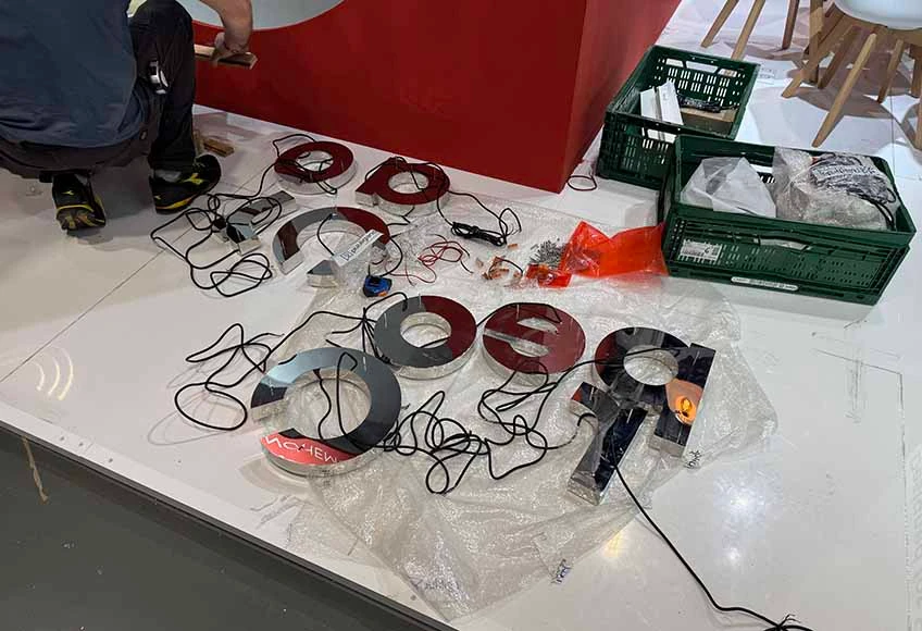
After approval, artwork still goes through prepress checks, material preparation, printing, finishing, inspection, packing and delivery. A textile may need sewing; a panel may need cutting or mounting. Replacing one graphic after printing has started can restart several steps while the truck departure remains fixed. Rush work may increase costs and reduce time for quality control. Graphic approval is a production deadline, not an administrative formality. The objective is a professional, complete stand when the exhibition opens—not an endlessly revised file that arrives too late.
From Design File to Printed Graphic: What to Know Before You Order
An approved visual is not necessarily a production-ready file. Ask for the printer’s specifications early, especially when a stand combines several materials and finishes.
File formats, resolution and bleed requirements for large-format print
Printers may request PDF, vector artwork or suitable raster files. Resolution, bleed, safe areas, scaling and color profiles depend on the final size, material and finishing method. There is no universal DPI or bleed value for every large-format application.
Materials and finishes: durability vs. reusability
Textiles, rigid panels, adhesive films and backlit materials behave differently. Choose according to the structure, lighting, handling, transport and whether graphics will be used at future events.
Working with your stand builder: timeline and revisions
Agree who supplies the files, who checks technical quality, who signs off the content and when print-ready approval is due. After that point, further changes may still be possible, but the consequences for cost and delivery need to be discussed openly.
Trade Show Graphics Mistakes to Avoid
Most graphic problems can be prevented. Watch for these five:
- Stretching unsuitable images: enlargement or aggressive cropping can ruin detail and composition.
- Overloading a wall with text: visitors cannot easily identify the main message.
- Inconsistent branding: disconnected colors, fonts and imagery weaken recognition.
- Ignoring viewing distance: a line that looks elegant on screen may be unreadable from the aisle.
- Approving too late: repeated revisions can threaten printing, transport and installation.
Color also behaves differently on fabric, rigid panels and illuminated surfaces. If exact matching is important, agree on proofs and acceptable tolerances before production, not when the truck is waiting.
A Good Graphic Is One That Does Its Job
Experienced exhibitors know that no single visual element determines a show’s success. Good booth graphics support marketing goals, fit the stand and can actually be produced on time. They do not need endless polishing in pursuit of an impossible ideal. At ESBAU, we want a stand that represents your company professionally and is ready on time. The best graphics are not the ones that survived the most revisions. They are the ones that work—and arrive on time.